Article published: 4/30/25
Breathing Life Into New Spaces | Sans 2.0
Challenge
Sans, a pioneer in water and air purification despite having a top-tier purifier, needed a stronger ecommerce presence. The Sans team sought to evolve their brand story, improve their core site metrics, and better their subscription experience. Sans came to Vaan at a critical point when the business evolved from a single product to a sustainable brand. Utilizing Brand Conversion Design, Vaan employed the latest Shopify 2.0 theme to refresh their online appearance. The focus of the project was on ensuring transparent communication, introducing engaging designs, and improving overall performance.Project Objectives
Evolve Brand Story and Expand Product Offering
- Expand the current one product focused air purifier site to include three new product lines - water purifier, humidifier, and smaller air purifier- shifting the narrative from being an air purifier brand to a healthy lifestyle brand.
Improve Core Site Metrics
- Leverage existing benchmarks and site data as a foundation to improve core eCommerce metrics. Expand testing to identify key gaps in the journey as areas of focus for the site redesign.
Improve Customer Subscription Experience
- Iterate on subscription offering on add on products to increase average order value and boost return customer rate.
Approach
Leveraging our VAAN Brand Conversion Design Process we began the Sans site redesign by engaging in our 5 phases of proven process.
Research- we first started with polls, scroll maps, and heuristic evaluations to better understand user actions on individual pages, and their engagement levels with various elements throughout the site. Subsequently the VAAN team then conducted WEVO tests and usability assessments into customer journeys optimized pathways to enhance on-site experience.
Identify- Following the research phase, our team reviewed the findings transitioning into the next phase of identification, focusing on opportunities for improvement and exploration. This step included defining the target audience, the brand’s value proposition, product differentiators, and the overall brand story
Sample- The next phase of the Brand Conversion Design Process involved compiling examples of other sites strategically addressing challenges identified during research and identification. Specifically sourcing examples of functionality and features, our team created sitemaps, story frames, and moodboards for the Sans team to review.
Mapping - Reviewing the existing Sans tech stack and aligning it with the envisioned end state of the redesign process our team mapped the desired functionalities to technology providers and made introductions to the Sans team.
New Design- derived from the learnings of the above 4 steps our team built high-fidelity “look & feel” direction mockups. These mockups gave the Sans stakeholders the opportunity to review and give input on the overall design feel, including but not limited to elements such as color palette, iconography, typography, and overall aesthetic.
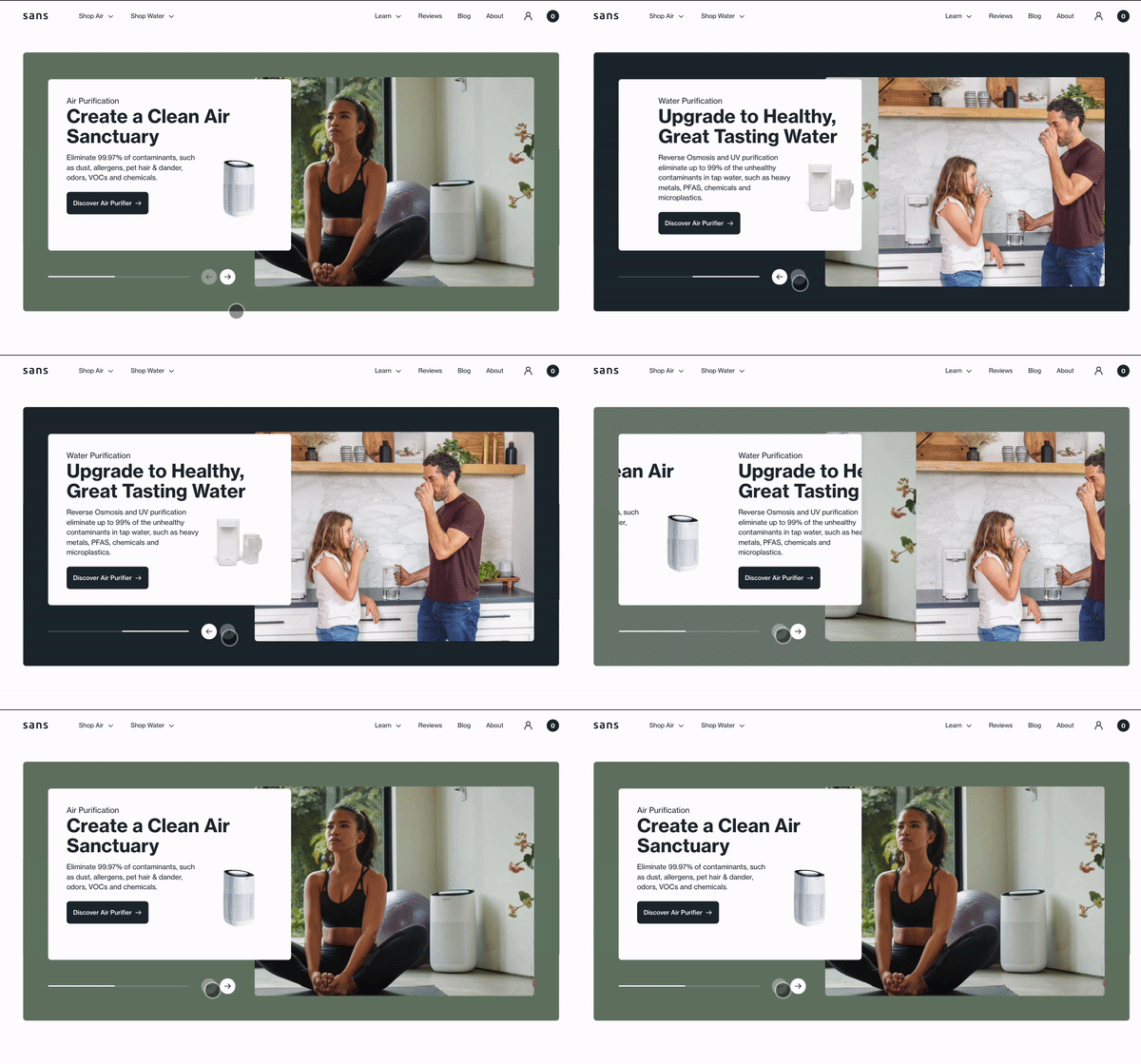
Results of the 5 step Brand Conversion Design process included the incorporation of lifestyle images which provided users with a glimpse of the product in its intended settings. Additionally, tailored pages for the Air and Water categories were created, enhancing user engagement and catering to the expanded product line. These enhancements in communication not only streamline navigation but also empower users with a clearer understanding of the products, ensuring a more seamless and informed journey through the Sans experience.

Subscriptions: Easy and Transparent
We aimed to create a purchasing experience where consumers could effortlessly acquire both the core product and the filters they need. Many customers purchase the core product due to concerns about allergens and air quality, but they often overlook the necessity of filters to maintain optimal performance. To address this, we implemented strategic storytelling to highlight the importance of both components working together. Full transparency was essential, so we made filter information easily accessible and integrated it seamlessly into the purchase flow, ensuring customers understood the full value of their purchase. By offering a simple, intuitive way to bundle the core product with a subscription for filters, we not only increased the average order value (AOV) but also boosted customer lifetime value (LTV). This approach led to a 24% increase in subscriptions.Visual Storytelling for Product Differentiation
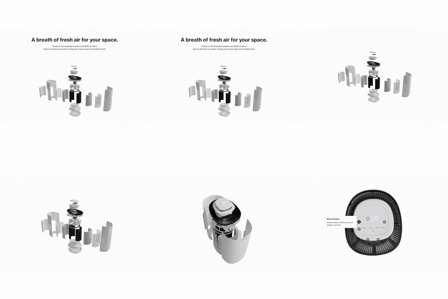
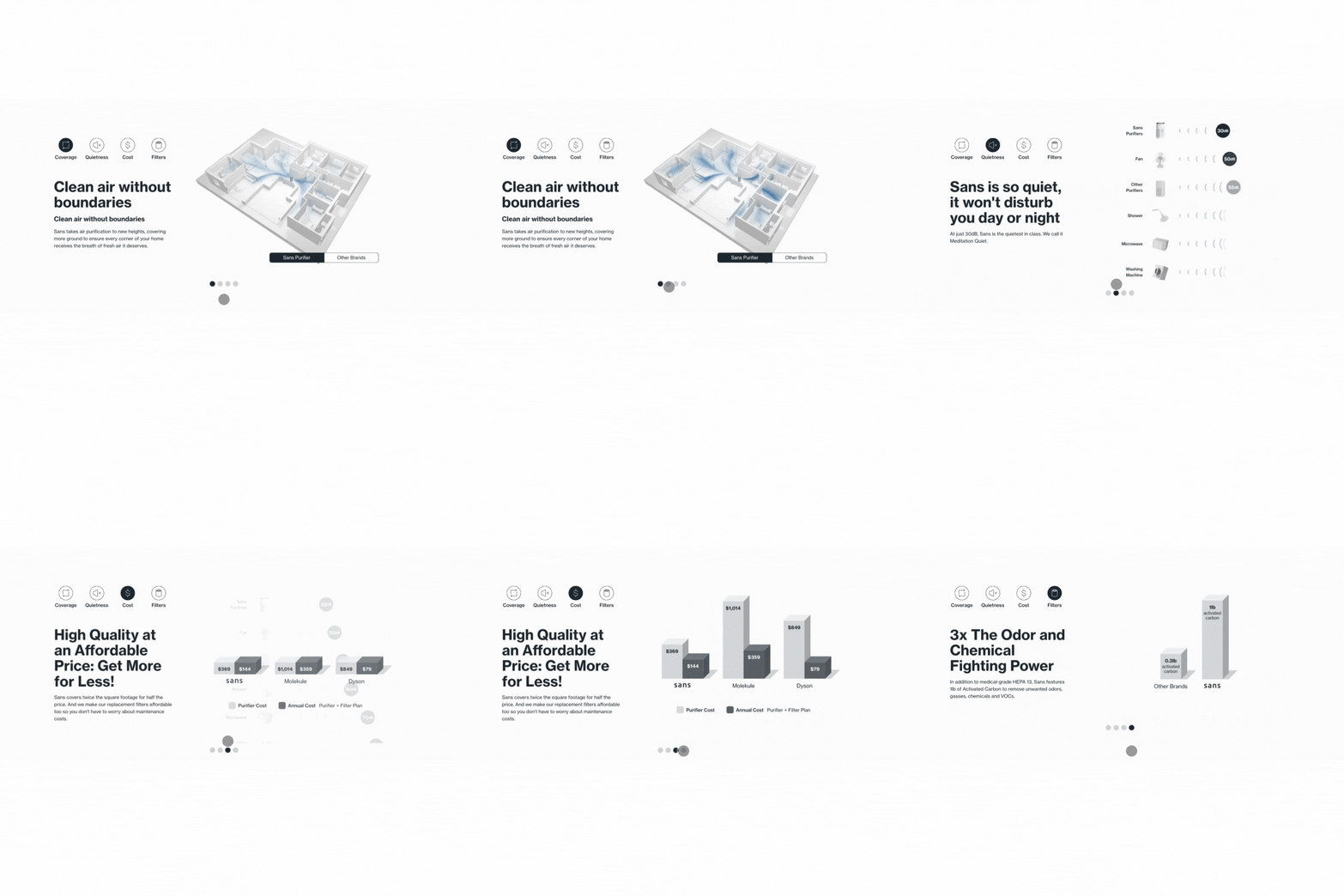
Sans's commitment to high-quality products demanded a shift in online representation. They sought a site design that could highlight the competitive edge of their product, substantiating their position as leaders in the industry. To rectify this, we used a combination of images and infographics for product comparisons against their main competitors, offering a visually engaging and informative perspective on product quality. This strategic enhancement clarified the value proposition, directly contributing to heightened customer engagement and loyalty.


Performance
Prioritizing user experience, Vaan implemented several features for efficient navigation. A custom minicart allowed for faster transactions, while the mega and burger menus improved overall navigation. Sticky elements, such as add-to-cart on Product Detail Pages (PDPs) and a Call-to-Action (CTA) on blog pages optimized the user journey, resulting in a transparent and efficient experience.Quantifiable Success and Validation
WEVO
Thorough testing served as the foundation for our data-driven design approach. Initial WEVO results indicated information overload, revealing user challenges with product page clarity. Following the implementation of our Brand Conversion Design strategy, post-launch WEVO results demonstrated significant improvement across first impressions, engagement, and intuitive categories. User feedback emphasized the website's "easy to navigate" and uncluttered design, highlighting the enhanced user-friendliness achieved through our redesign. This raised an overall 22% increase in first impressions in comparison to the original site which lacked clarity and was overloaded with information. We also saw a 26% increase in engagement with many users appreciating the new visual and interactive elements. Particularly captivating were the lifestyle images, demonstrating the impactful presentation of the product in its intended setting. Lastly, we saw a 13% increase in the intuitive category which tests the visitors ability to easily navigate and interact with the website. Many found the product descriptions to be “informative” and the “controls easy to navigate” contributing to a more seamless user journey. Overall these enhancements, centered on clarity, successfully alleviated initial pain points and contributed to a more user-friendly and engaging platform.
Intelligems
To further ensure the success of the site’s redesign, Sans and VAAN conducted comprehensive A/B testing using the advanced capabilities of Intelligems. The tests diverted some visitors to the old site and others to the redesigned version, allowing Sans and VAAN to see the effects of the changes before the official launch. Directly comparing the old site to the new created a data-driven approach to optimizing the website. The split tests looked at the differences between the two sites, providing a reliable assessment of the changes’ impact.
The results were compelling. The redesigned site saw a 21% increase in Conversion Rate and a 6% boost in Revenue Per User. Thanks to Intelligems’ A/B testing capabilities, Sans gained vision into what they could expect once the new site went live.